Xfce4-whiskermenu-plugin 2.4.0 Greatly Improves The Alternative Xfce Desktop Menu
The latest version of the optional Whisker menu for the Xfce desktop environment has a tree view for categories with sub-folders, an option to show menu items as icons with text below similar to file managers, a new option to hide menu item by right-clicking on them and choosing "Hide application" and much more. The new icon view, which worked fine up to a day ago is, unfortunately, all messed up in this release.
written by 林慧 (Wai Lin) 2020-01-10 - last edited 2020-02-13. © CC BY

Xfce4-whiskermenu-plugin 2.4.0 has a new tree view for menu folders with sub-folders.
Developer Graeme Gott has put a lot of hard work into making the optional Whiskermenu for Xfce4 better since Xfce4-whiskermenu-plugin 2.3.5 was released last month.
One visual change which is immediately apparent is that the menu categories are now on the left side of whiskermenu's window.

Xfce4-whiskermenu-plugin 2.3.5 had the menu items on the left side and the menu categories on the right side.
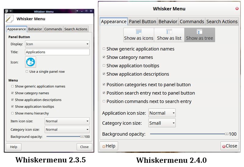
Another big change, which is not immediately apparent, is that Whiskermenu 2.4.0 can show menu items as a plain list, a tree or icons with text below similar to a file managers folders view. This can be enabled by right-clicking on the Whickermenu icons and choosing .

Whiskermenu 2.4.0 has some new options available. Nevermind the client side decorations, you will only get those if you use the current Xfce 4.16 development branch.
The Fancy New Icon View Is, Unfortunately, Broken In The 2.4.0 Release[edit]
The shiny new icon view feature in Whiskermenu 2.4.0 used to work just fine up to a few days ago. The icon view in whiskermenu git looked like this:
![]()
Whiskermenu git had a fancy new icon view which worked as it should.
The fine icon view feature got all messed up in whiskermenu git commit 98a6cf3bc74f5c8 titled "Stretch iconview columns to fit.". That commit, which made it into the Whiskermenu 2.4.0 release, makes the new icon view look strange and the menu item text is totally unreadable:
![]()
The icon view in the Whiskermenu 2.4.0 release.
It is very unfortunate that whiskermenu git commit 98a6cf3bc74f5c8 made Whiskermenu's otherwise fine new icon view unusable in the 2.4.0 release.
Other interesting features in Whiskermenu 2.4.0 include:
- You can right-click on menu items and permanently hide them from the menu with . You can't do that with categories, only applications.
- The search bar on the top of the window can be used to search menu items by keyword
- The context menu has icons, not just text
- The session confirmation dialogs are re-arranged
- The menu item loading code is re-written to match GarconGtkMenu.
- Translations for a lot of languages have been updated.
The source for this release can be acquired from archive.xfce.org. Don't forget to reload the panel with xfce4-panel -r after upgrading to a new version of a Xfce panel plugin like whiskermenu.
Whiskermenu 2.4.0 works on both the current stable Xfce 4.14 release and the upcoming Xfce 4.16 which is scheduled to be released later this year.
 |
Update: Graeme Gott has released Whiskermenu 2.4.1 with two patches who fix the unfortunate icon view issue in Whiskermenu 2.4.0 when it is built against newer Pango versions (The icon view in Whiskermenu 2.4.0 is apparently fine if it is built against Pango versions <1.44). That is the only difference between 2.4.0 and 2.4.1. |


Enable comment auto-refresher